Contura Orthopaedics | Building a Consistent Brand for Arthrosamid®
Creating a practical brand framework that enables clearer, more consistent communications with healthcare professionals.

01 • THE CHALLENGE
The Challenge
Following the creation of a detailed HCP-focused detail aid, the client identified the need for a formal brand book. Although the logo had recently been refreshed, there was no central brand guidance in place.
With new materials being developed and multiple stakeholders involved, consistency of messaging, design, and brand application had become increasingly important. This presented the ideal opportunity to define and formalise the Arthrosamid® brand.
02 • THE thinking & Doing
Our Thinking & Solution
Working collaboratively with Contura, we structured the brand book around their specific needs and business objectives.
We began by auditing existing Arthrosamid® materials to assess consistency across design and messaging. Drawing on insights from Contura’s sales team, alongside our branding expertise, we defined the brand’s positioning, tone of voice, terminology and key messages for healthcare professionals, with later expansion for patient-facing communications.
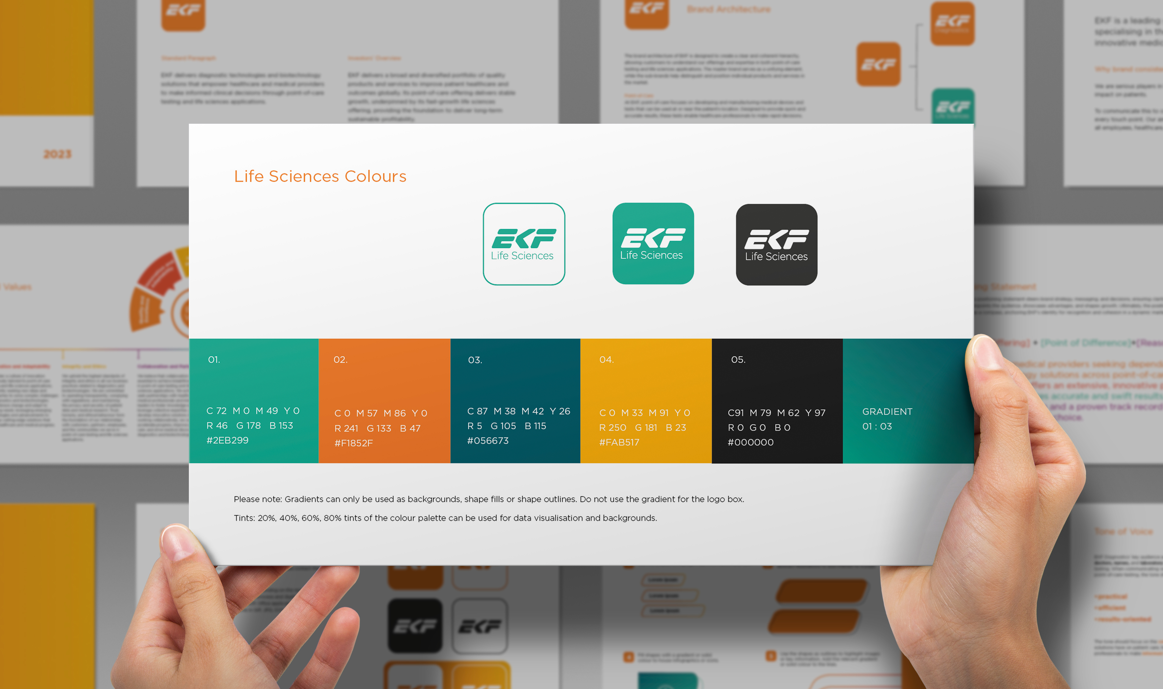
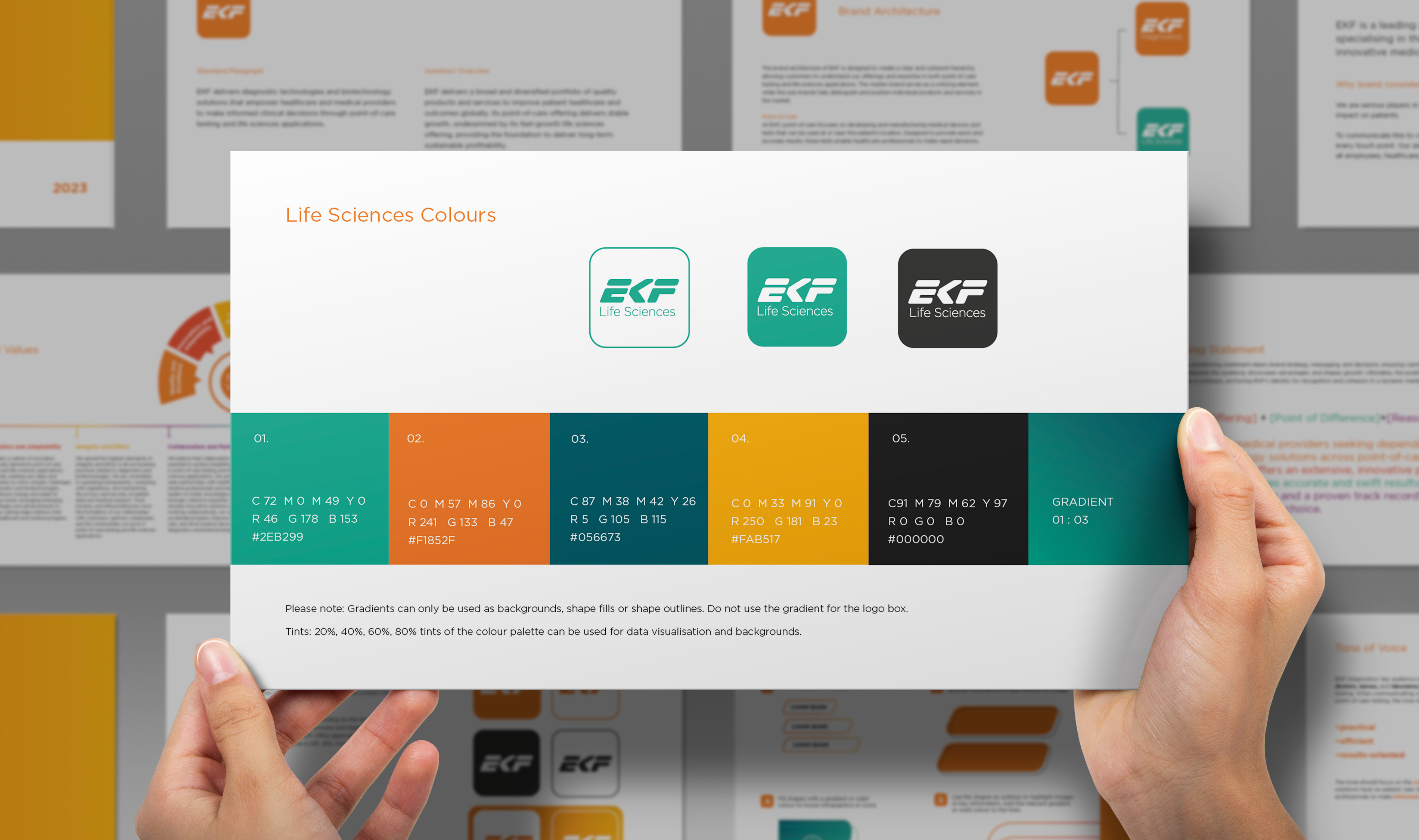
The visual identity was refreshed and refined, including updated typography, colour palette and photographic style.These elements were brought together through a clear, practical design system,supported by straightforward guidance on brand application and referencing. This ensured the brand could be applied confidently and consistently across all future materials.
03 • RESULTS & IMPACT
The Approach
Working collaboratively with Contura, we structured the brand book around their specific needs and business objectives.
We began by reviewing existing Arthrosamid® materials to assess consistency across design and messaging. Drawing on insights from Contura’s sales team, alongside our branding expertise, we defined the brand’s positioning, tone of voice, terminology and key messages for healthcare professionals, with later expansion for patient-facing communications.
The visual identity was refreshed and refined, including updated typography, colour palette and photographic style. These elements were brought together through a clear, practical design system, supported by straightforward guidance on brand application and referencing. This ensured the brand could be applied confidently and consistently across all future materials.
Key deliverables included:
- Comprehensive Arthrosamid® brand book
- Brand positioning statement and core messaging framework
- Tone of voice and terminology guidance
- Visual identity refresh (typography, colour palette, imagery)
- Design system and layout principles
- Brand application and referencing guidelines
The Impact
The new brand book established a single,authoritative reference point for Arthrosamid®, transforming how teams developand evaluate brand materials.
It enabled greater consistency,credibility, and recognition across all communications, while streamliningcollaboration between internal teams and external agencies. The result was astronger, more cohesive brand that supports long-term growth and brand loyalty.
“Thank you so much, the brand book has changed my life!”
Marketing team member, Contura Orthopaedics